Football data has never been more accessible. Whether you’re a first-team analyst at a professional club, a scout building a recruitment list, or a coach preparing player reviews, visualisation tools like radar charts, pizza charts, and scatter plots have become part of the standard toolkit.
They distill hundreds of rows of performance metrics into shapes and plots that the human brain can process in seconds. But like any tactical system, their effectiveness depends on how you use them. Misapplied visuals can mislead, overhype, or obscure — the football equivalent of a tactical plan built on bad video angles.
This article breaks down the correct application of these tools, their ideal use cases, and the common traps to avoid, with examples that mirror real-world recruitment, opposition analysis, and player development work.
Radar Charts: Building a Player’s Statistical Fingerprint
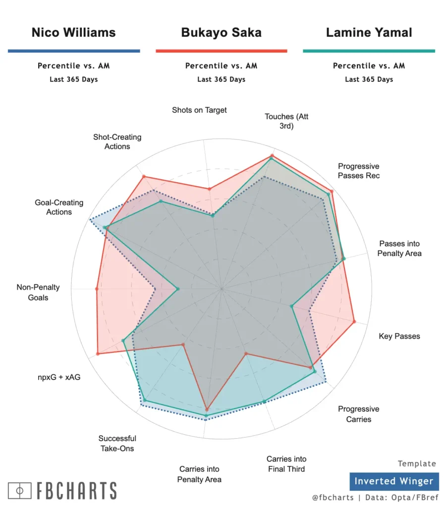
Radar charts plot multiple metrics radiating from a central point, creating a visual “fingerprint” of a player’s style and strengths. They are particularly useful when you want to understand how a player performs relative to their peers across several dimensions at once.
When to Use
- Player comparisons — e.g., comparing two strikers for shot volume, pressing actions, and aerial ability on the same axes.
- Role fit assessment — e.g., checking whether a midfielder’s defensive metrics suit a high-press system.
- Style mapping — wide, rounded shapes suggest a balanced profile, while spiky shapes indicate a specialist skill set.
Best Practices
- Scale correctly — Always benchmark against an appropriate peer group (league, position, or competition level). Comparing a Ligue 2 winger to Premier League averages will distort perception.
- Choose metrics wisely — 8–12 metrics is the sweet spot. Select a mix that reflects both style and output.
- Use per 90 or possession-adjusted stats — This levels the playing field between players with different minutes or team styles.
Applied Example
If you’re recruiting a striker for a direct attacking team, you might build a radar showing xG per 90, aerial duels won, progressive receptions, and pressing actions. This allows you to instantly see if the candidate offers the movement, physicality, and defensive contribution the system requires.
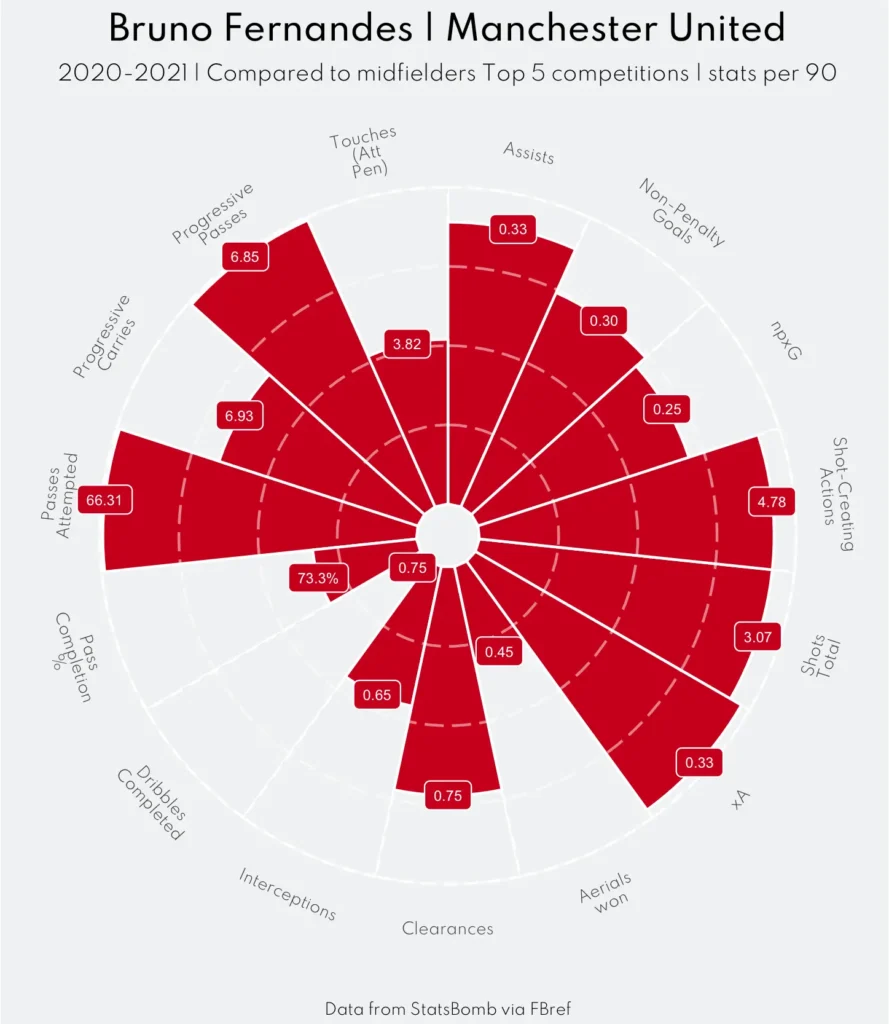
Pizza Charts: Percentiles That Speak to Everyone
Pizza charts are essentially segmented radars, but with percentile rankings written inside each slice. This makes them more intuitive for people who are less familiar with reading statistical shapes — particularly coaches, players, or executives.
When to Use
- One-to-one player reviews — players can instantly see where they stand compared to their positional peers.
- Recruitment presentations — simplifies communication with stakeholders who need quick clarity.
Best Practices
- Always use percentiles — Seeing “85th percentile for progressive passes” is more intuitive than raw counts.
- Mix usage and outcome metrics — This helps distinguish between volume (e.g., number of carries) and effectiveness (e.g., progressive carry completion rate).
- Group metrics logically — For example, keep defensive metrics on one side, attacking on the other for visual balance.
Applied Example
If a fullback ranks in the 90th percentile for progressive passes and 85th for carries but only 35th for crossing accuracy, the pizza chart quickly shapes the coaching discussion: they’re an excellent ball progressor but may need targeted work on final-third delivery.
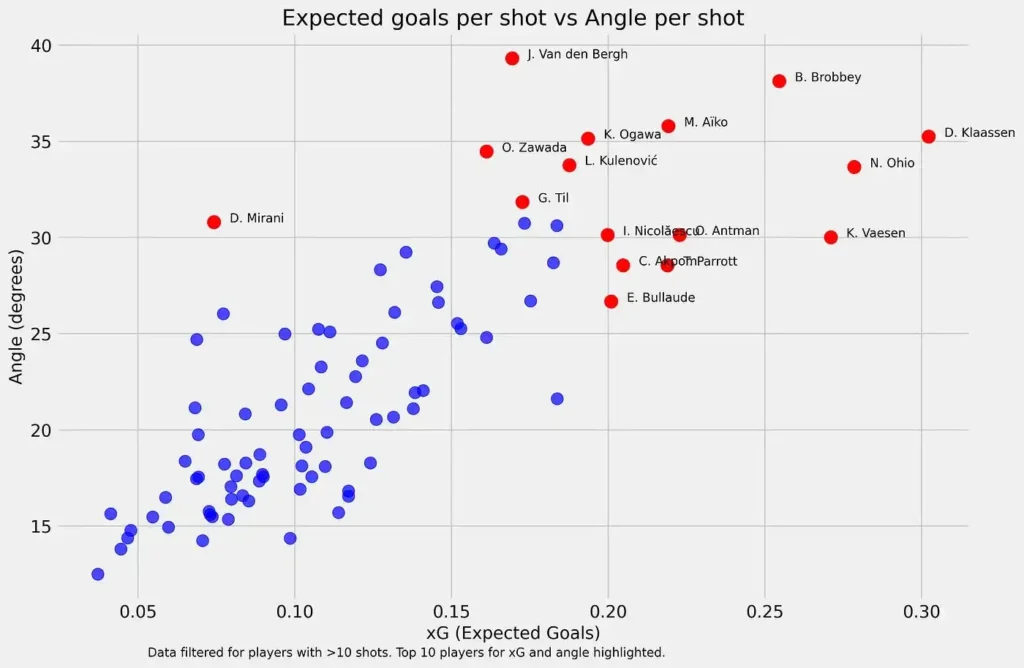
Scatter Plots: Finding Patterns and Outliers
Scatter plots map two variables on X and Y axes, making them excellent for spotting relationships, trade-offs, and unique profiles.
When to Use
- Recruitment shortlists — Identify players who combine two desired qualities, like high chance creation and strong defensive output.
- Tactical trend analysis — Compare how different forwards operate in terms of touches in the box vs. shots from outside.
- League-wide benchmarking — See where a player sits relative to the competition.
Best Practices
- Pick meaningful variables — A scatter is only as good as the relationship you’re testing.
- Highlight selectively — Focus on relevant targets or notable outliers instead of cluttering the plot with every name.
- Add contextual lines — Vertical and horizontal lines showing league averages help frame performance.
Applied Example
If you’re facing a team that presses with three high attackers, a scatter plot of goalkeeper long pass accuracy vs. average pass length can help identify whether your keeper can bypass that press effectively — a key tactical decision point.
Tactical Layer: Why Visuals Need Context
The most common misuse of these charts is removing the football from the numbers. Data visuals must be read in context:
- Tactical role — A deep-lying playmaker’s progressive pass numbers will naturally differ from a box-to-box midfielder.
- Team style — A high-possession side will inflate passing metrics but may reduce defensive duel opportunities.
- League strength — A player dominating in a lower division may see those numbers drop in a higher tier.
Ignoring these factors is like judging a team’s defensive solidity purely on goals conceded without considering their xGA or fixture difficulty.
Common Pitfalls Across All Formats
- Cherry-picking — Choosing only stats that support a narrative creates bias.
- Small sample sizes — Early-season or post-injury stats can be misleading.
- Overloading visuals — A chart should be instantly readable, not a “Where’s Waldo” puzzle.
- No benchmarks — Without a reference group, a 5 progressive passes per 90 stat is meaningless.
Conclusion: From Chart to Coaching Action
Radars, pizza charts, and scatter plots are not ends in themselves — they are conversation starters. They point you toward questions to answer with video, tactical observation, and live scouting.
For a coach, they can shape role expectations. For a scout, they can refine shortlists. For an analyst, they are a bridge between raw data and decision-making.
Used well, they make data clear, comparable, and actionable — the three things every football decision-maker needs when time is short and the stakes are high.